A Guide to Restaurant Websites
A restaurant website in this age of digital media is no less than a virtual storefront. In 62% of the cases, the website is the first point of contact between a customer and a restaurant. Therefore, an aesthetically pleasing and practical website can make a big difference to your profit margins, helping to pull in customers, display specials and discount offers, and most importantly, offer online delivery services. Read on to find out what makes a great restaurant website.
Design & Branding
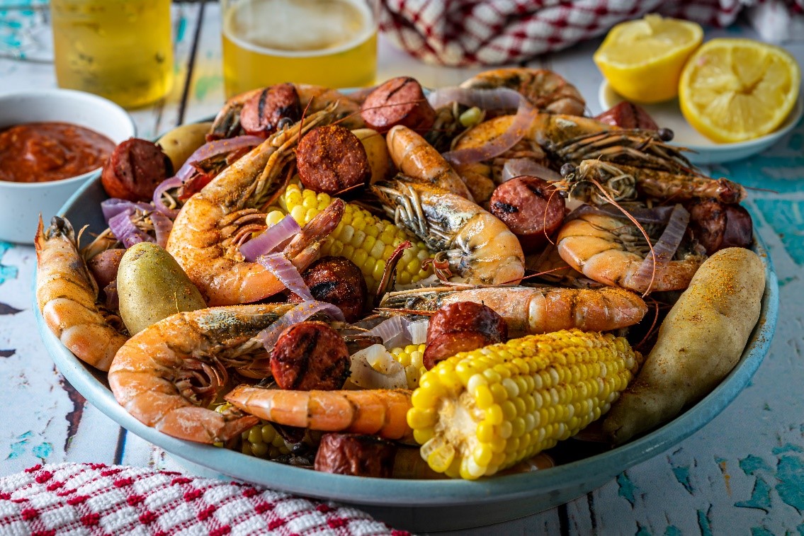
The design of the website should mirror the identity your restaurant embodies. Let the colour palette and typography reflect your brand identity and values. Effective usage of high-quality images of your dining room and food is crucial, as visuals can significantly influence dining decisions and play a big role in someone’s decision on where to dine. Ensure to be consistent with your branding on all pages of your website; maintain the logo, colour scheme, and overall aesthetics on all pages.
Online Ordering & Reservations
Include an online ordering system that’s easily accessible and integrated with your POS system. This integration optimises workflows, minimises the potential for mistakes, and enables customers to make quick payments. An online reservation system can dramatically improve the customer experience and your table management.
Mobile Optimisation
Over 60% of restaurant searches are now from mobile devices, and therefore, responsive design is non-negotiable. Your website must be able to adapt to each and every screen size, no matter how small or big. It should offer an ideal reading and navigation experience across smartphones, tablets, or desktops. This includes having touch elements that are easily tappable, being able to read text without zooming in and out, as well as a mobile-friendly navigation menu.
Page Load Speed
Fast loading times are important for user experience as well as search engine optimisation (SEO). Decrease image size by compressing them along with maintaining optimal quality, leverage browser caching static content, and minimise HTTP requests. When it comes to load speed keep your page times under 3 seconds to decrease bounce rates.
User-Friendly Navigation
Create a simple and intuitive hierarchy by category for easy navigation. Add a visible search bar for easy and quick access to desired details. Also, try to make sure that important pages such as the menu, reservations page, hours of operation, online ordering, and location are accessible from all parts of the website.
Content Management Systems (CMSs)
Use a user-friendly CMS (like WordPress, Squarespace, or Wix) that enables staff members to make changes easily without having a technical background in web development. This will help you keep the website up to date without calling in experts every time you need to upload or change something small.
SEO Optimisation
Implement local SEO strategies to achieve better visibility in the search results. Use geographic keywords, optimising Google My Business listings, and embed the schema mark of rich snippets in search results. Keep on optimising your search engine rankings by adding and updating content with more relevant keywords.
Essential Information
Prominently display crucial information such as location with embedded map, operating hours, contact & reservation, and specialties. Include an FAQ section to deal with common queries and reduce staff workload.


